RED
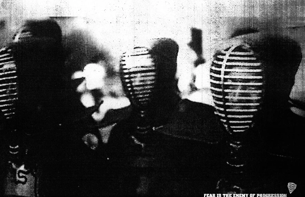
FEAR IS THE ENEMY OF PROGRESSION.
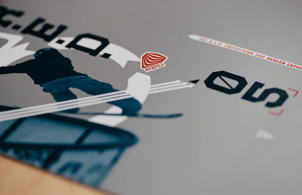
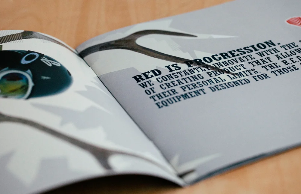
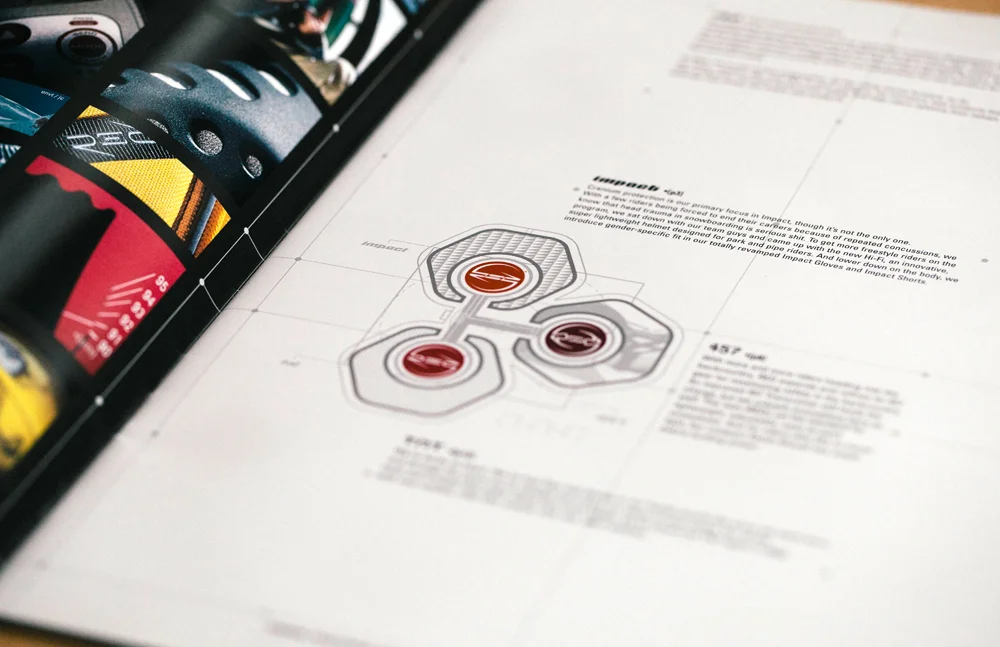
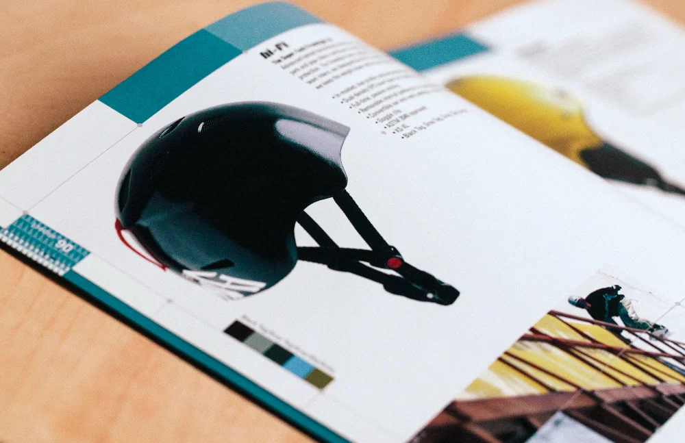
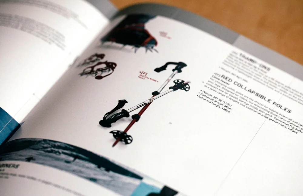
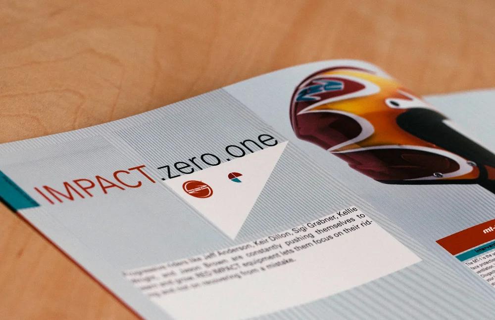
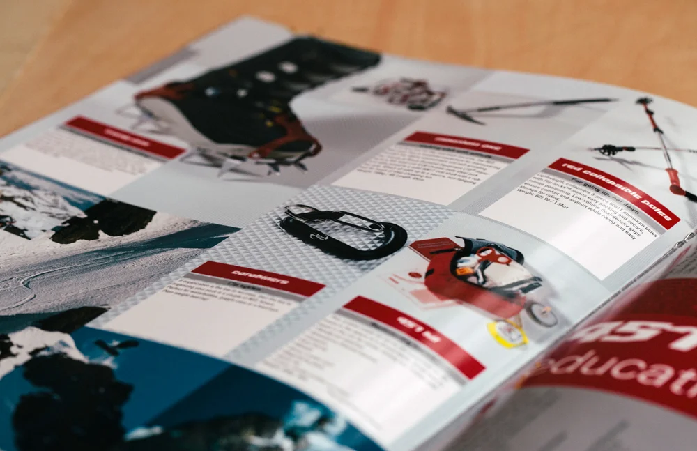
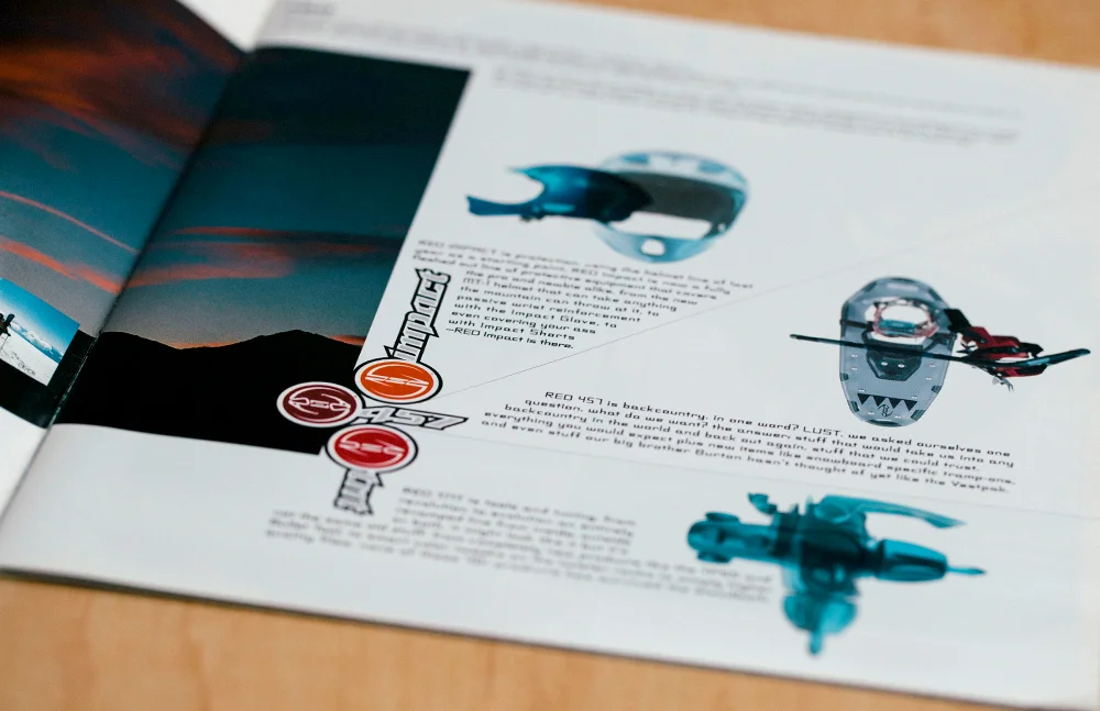
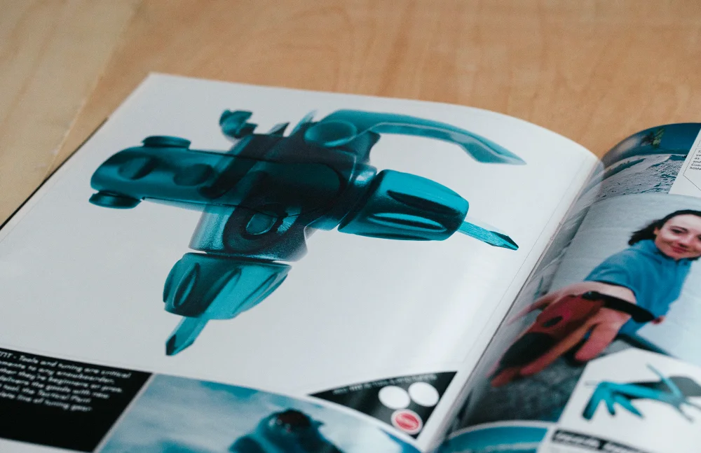
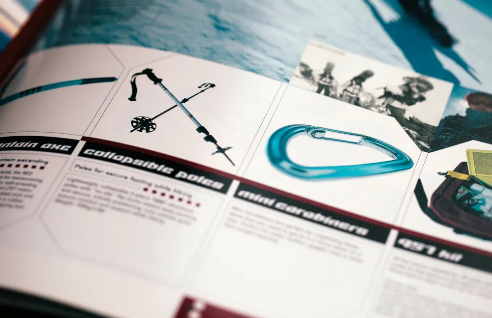
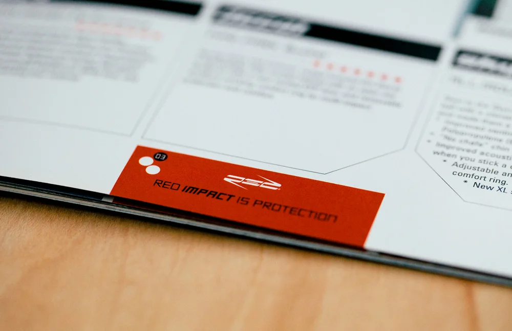
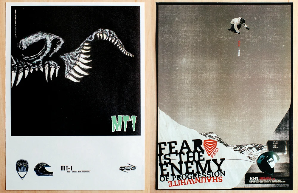
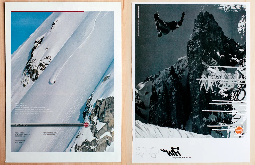
RED started as R.E.D. for Riding Enhancement Devices, a line of technical accessories created by Burton that included anything everything that made riding better. Leashes, wax, stomp pads ... at one point that made for over one hundred products. Around 1999, when my team took over the RED work, the line increased to include protection (driven by helmets) and backcountry gear. R.E.D. then splintered into 3 segments: R.E.D. 457, R.E.D. Impact and R.E.D. TnT, and 3 variations of the R.E.D. logo was created to speak to these different target audiences and in some cases, different retailers. It wasn’t until the 2005 season, aided by an increase in the popularity of helmets, that Burton finally absorbed TnT (Tools n’ Tuning) and 457 (backcountry) and R.E.D. was allowed to focus solely on protection, at which point the protection icon was created and is still used to this day. A few years later R.E.D. simply became RED.
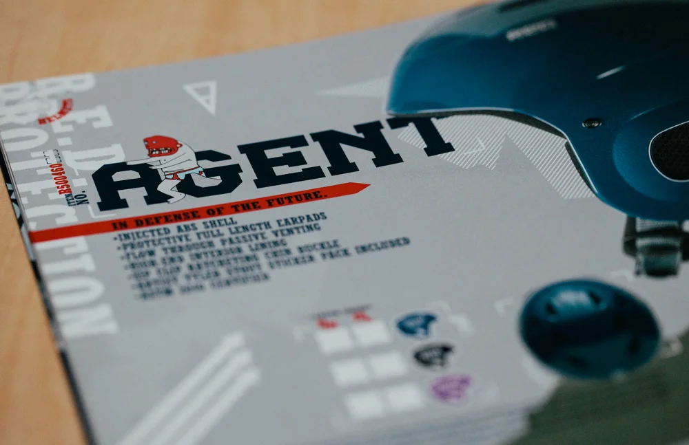
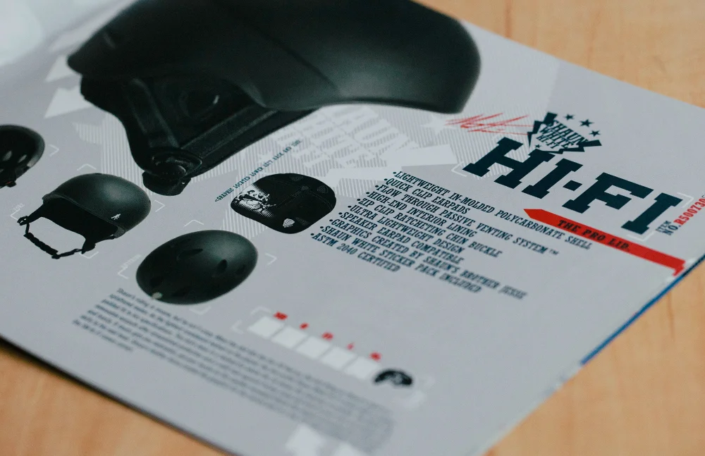
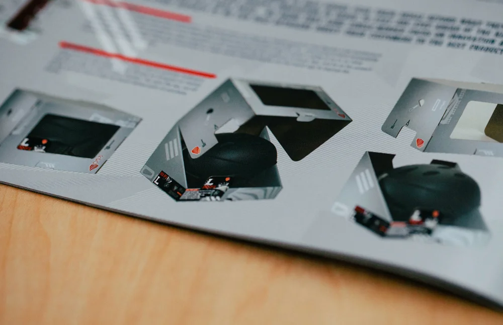
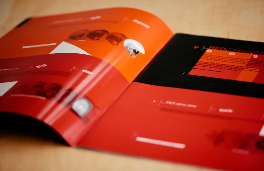
I normally handled identity development, product naming, catalog design and overall design direction of the RED work, but it was definitely a team effort that included nearly every possible design execution for RED including product color and graphics, print advertising, packaging, point of sale, and trade show presence. With 100+ products some seasons it was a lot of fun design and one of my team’s favorite things to work on. Getting powder “research” days didn’t hurt either.
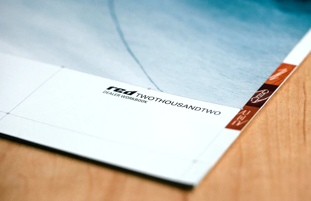
(1999-2005. Work created at JDK.)