New Era Cap
IT’S NOT A CAP, IT’S A FLAG.
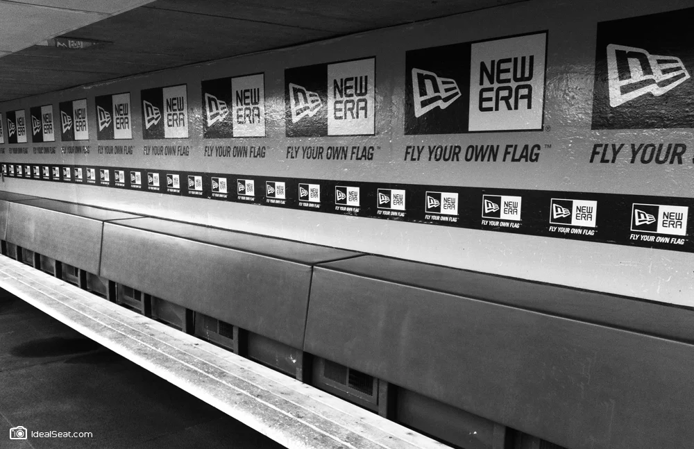
Even though it wasn’t granted an official exclusive contract until 1993, New Era had been supplying on field caps for the MLB since 1934. Not long after that 1993 contract, a certain footwear company based in the Pacific Northwest made a big play to be the on-field cap supplier for the MLB. At that point New Era knew the time had come to begin building a consumer-facing brand. The new identity needed to simultaneously introduce New Era as a lifestyle brand, represent it’s rich heritage in American sport and domestic manufacturing, be iconic and recognizable on a cap, immediately position them as a leader amongst the most progressive, world-class sports brands of the day and be a durable mark that would last for years. In 1997 New Era approached JDK to help them achieve these goals. I was lucky enough to be on the team that was awarded the work, and even more fortunate to have been trusted to create the icon. In 2012 the mark celebrated it’s 15th birthday, not bad.
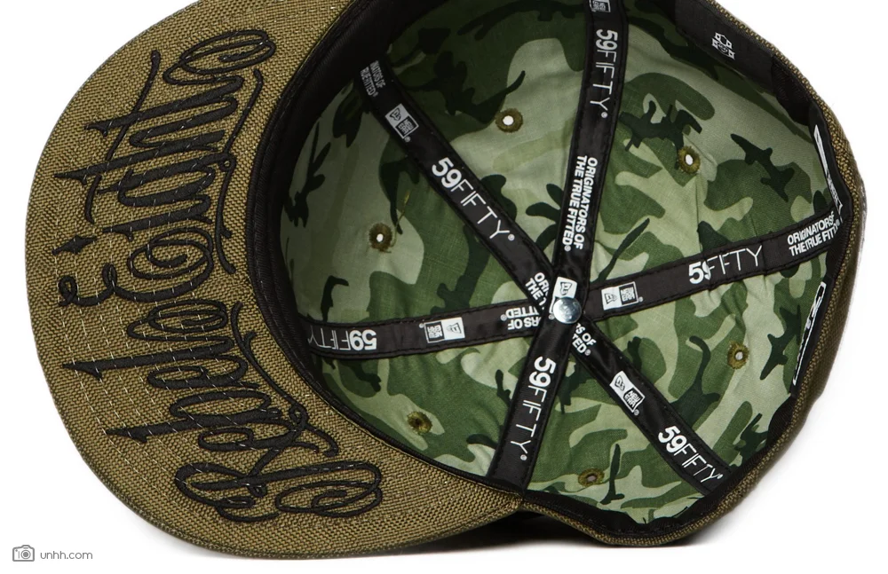
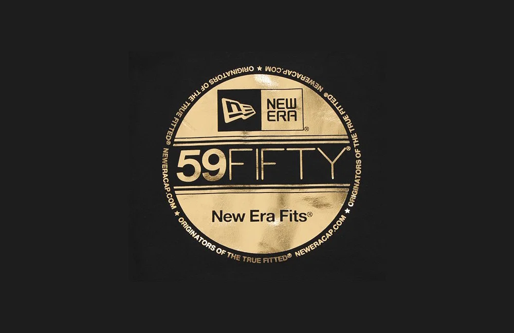
Not long after designing the mark I started my own team at JDK, but before leaving the team I redesigned the interior of the cap, ridding it of several interior loop tags by introducing interior taping that now carried that information. This technique that was later knocked off by competitors, but not until it had become a 59FIFTY earmark. I also created the 59FIFTY signature, and cap model branding system, a paradigm that exists to this day.
(1997. Work created at JDK.)


