
Nashville Predators
INTRODUCING THE NHL TO THE DEEP SOUTH.
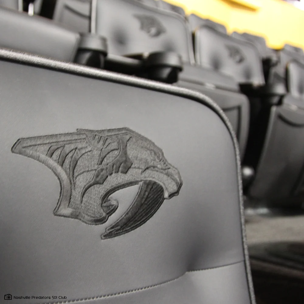
In 1997 Nashville was granted and expansion franchise and work began to prepare the franchise for the 98 season. From the start the project had rather interesting challenges, most notably bringing hockey to the deep south and conceptualizing a logo for a team named “The Edge” (which was the original name for the team). Through research I learned that the single largest sabre tooth tiger tooth was found during the excavation of the downtown Nashville First American building. That became the focus of my inspiration.
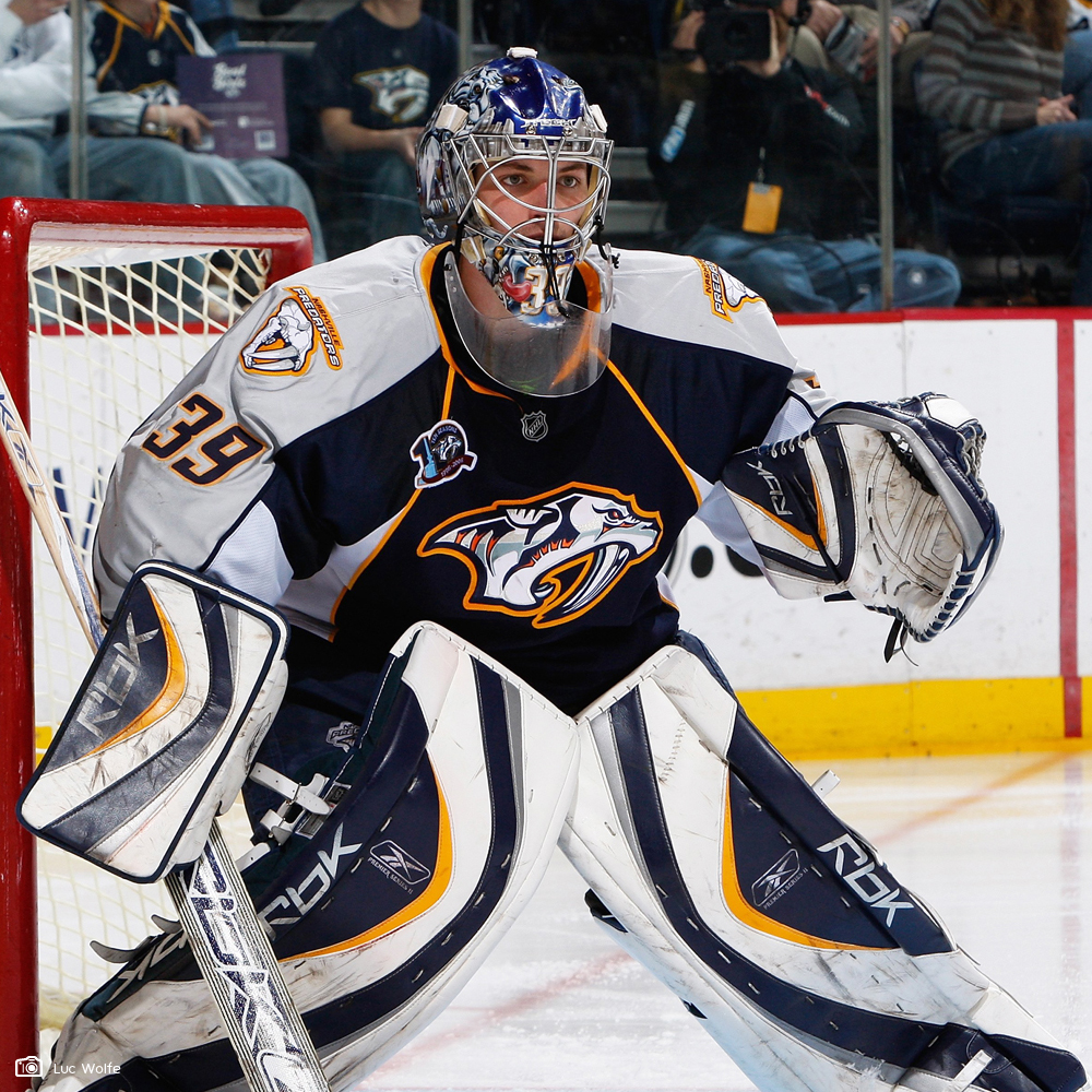
To bridge the two main challenges I pushed to create a mascot-based logo to give traditional team sports fans a connection point, and to use the tiger tooth as the expression of “The Edge”. This direction was chosen and after much exploration and refinement we had an identity. However, 2 weeks before launching the identity the NHL informed the franchise that there was a name conflict: Edge shave gel was an NHL property so the name had to change. Among many name suggestions, The Predators was chosen via fan vote and a team was born. Since then the team identity has been embraced, spawning an alternate prehistoric sabre-tooth icon and a sabre-tooth mascot for games and related events.
(1997. Work created at JDK.)