Magma
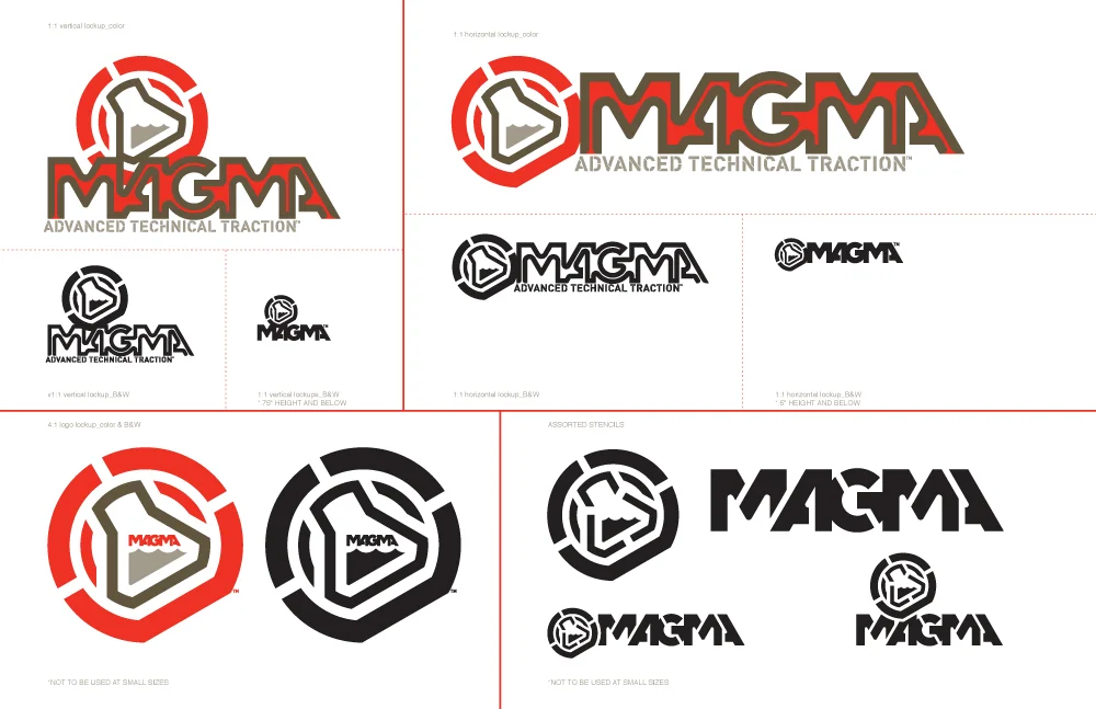
ADVANCED TECHNICAL TRACTION
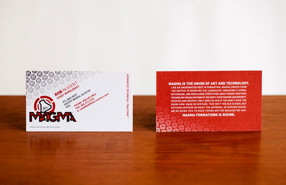
In 2003 I was contacted out of the blue by a young entrepreneur who simply wanted to get permission to use a font I created for another client, but ended up getting a full identity package. From the brand name, to packaging, to copywriting & messaging, to the shape of the wax bar I was able to dig in deep on this project due to a trusting client and the new found time I had after resigning from JDK (after 9 epic years).
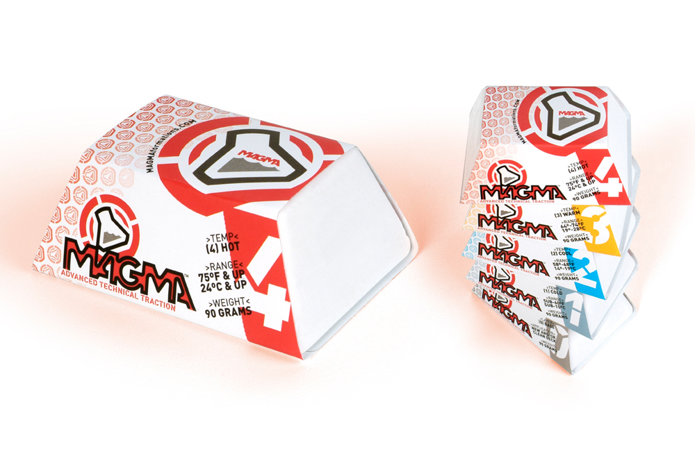
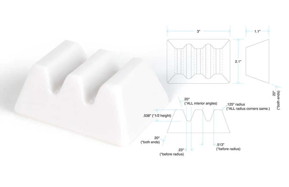
I am quite proud of this little project that grew from humble beginnings (this was literally started in a San Diego garage), but as a latent industrial designer I might be most proud of the bar design. With the exception of Sex Wax, all of Magma’s competitors had bars with virtually the same proportions and basic shape, this presented us with a clear opportunity to punch a hole in the retail environment. The new design gave us 40% more branding space on the front panel, the 3 section design gave us a bar that broke into perfect chunks for waxing and none of this increased the weight one gram. Years after launch he sold the brand to another major wax manufacturer, the packaging changed slightly but the bar design (as well as logo and logotype) lives to this day.
(2003.)