
Giro
THE MARK OF ARTISTRY AND INNOVATION.
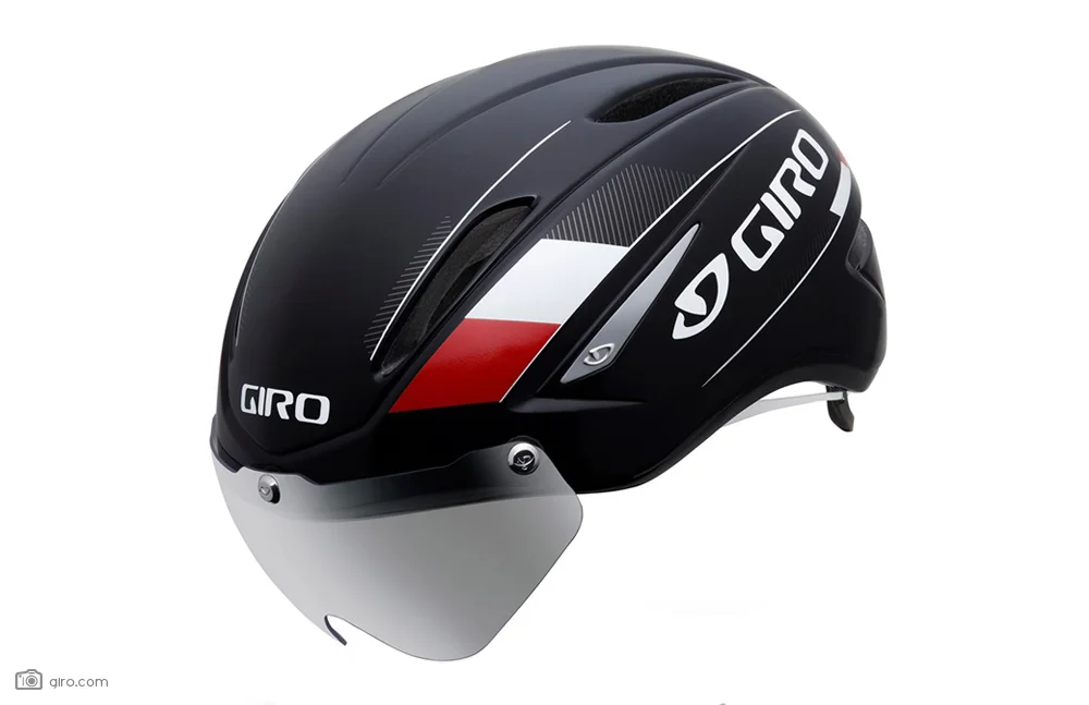
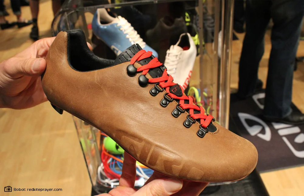
Founded in 1985, Giro has created a rich history in cycling by delivering the best helmets in the industry, but it’s their commitment to innovation through design that has lead to their growth and core following. In 2006, after years of solid growth, Giro was poised to expand into new markets and I was engaged to create the visual identity that would position them for the future. This endeavour included product expansions into footwear, softgoods, eyewear and goggles. It had to work embossed on the head of a rivet and billboarded on race boundary banners. Another key component was marking their transition from an equipment brand to a lifestyle-driven brand, while not losing their current loyal base and appealing equally to men and women.
Apart from future goals, they also had the immediate need to unify their brand identity: in the year 2000 they added a separate mark to speak directly to the snowboarding and skiing market when they introduced snow helmets. This new identity would have to speak to both audiences, which would then allow Giro to use a single logo and maximize brand equity across all 4 seasons of advertising, retail and product presence. The end goal being to ultimately unify the brand. Lastly, the mark needed to represent Giro’s brand soul and mantra “Artistry and Innovation”. The work was completed in March 2006 and it was incredibly satisfying to see the marks loud and proud on time trial helmets in the Tour De France just a few months later.
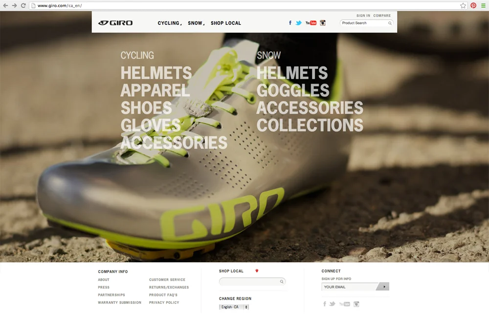
(2006. Website example designed by Giro.)