

Anon Optics
HIDE IN PLAIN SIGHT.
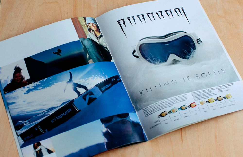
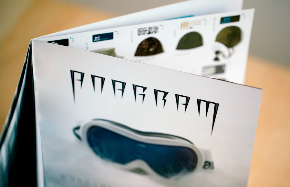
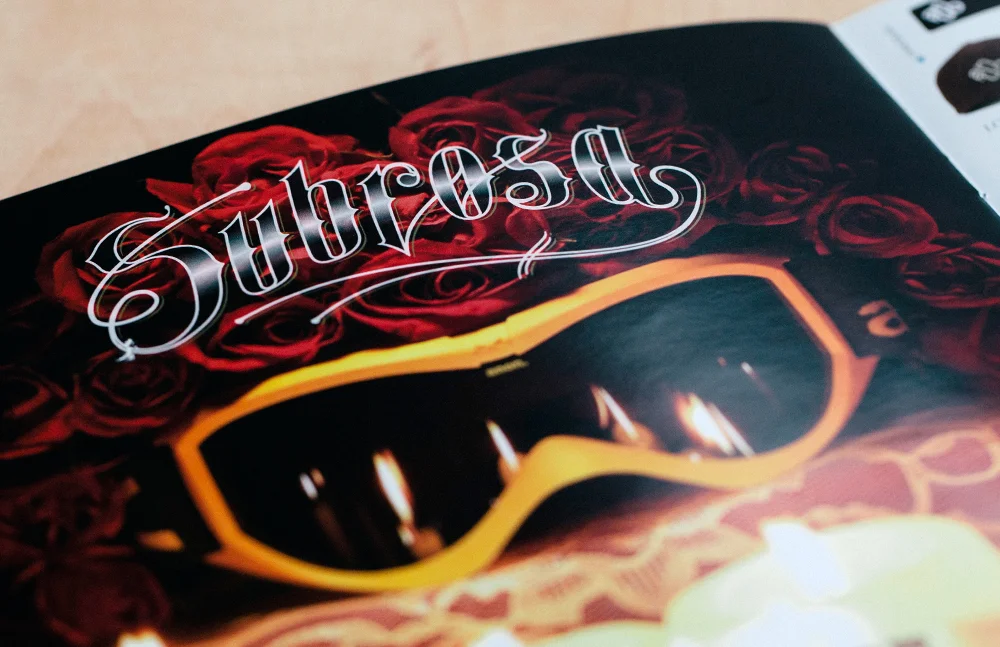
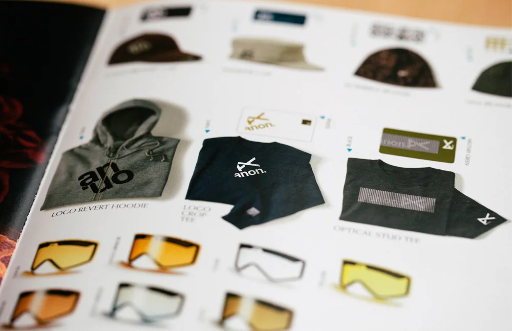
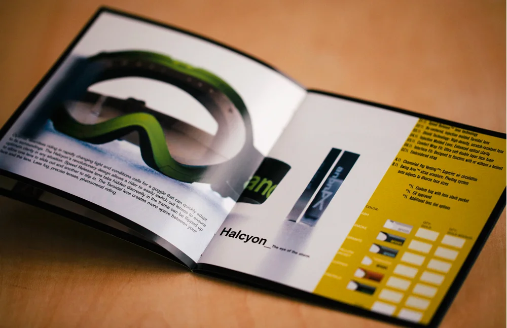
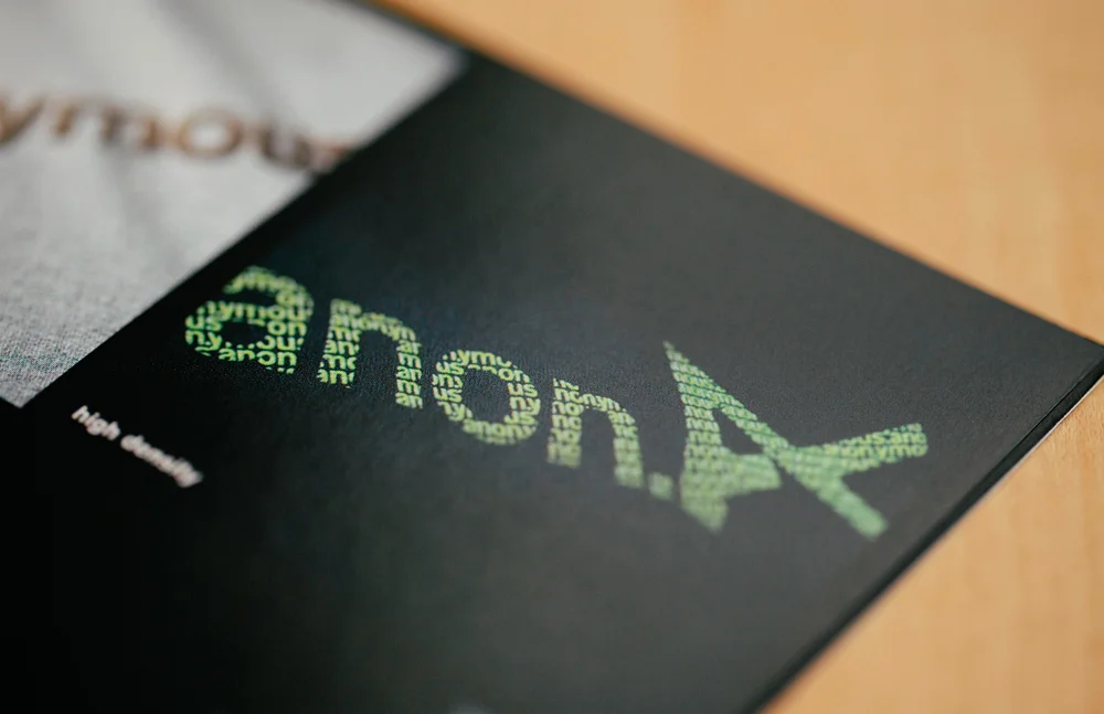
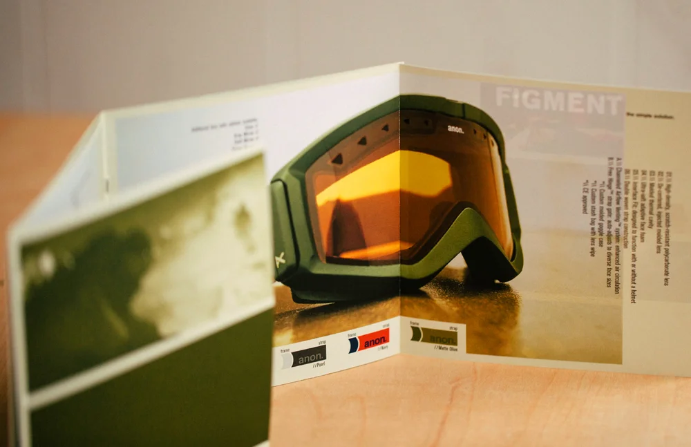
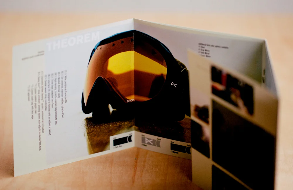
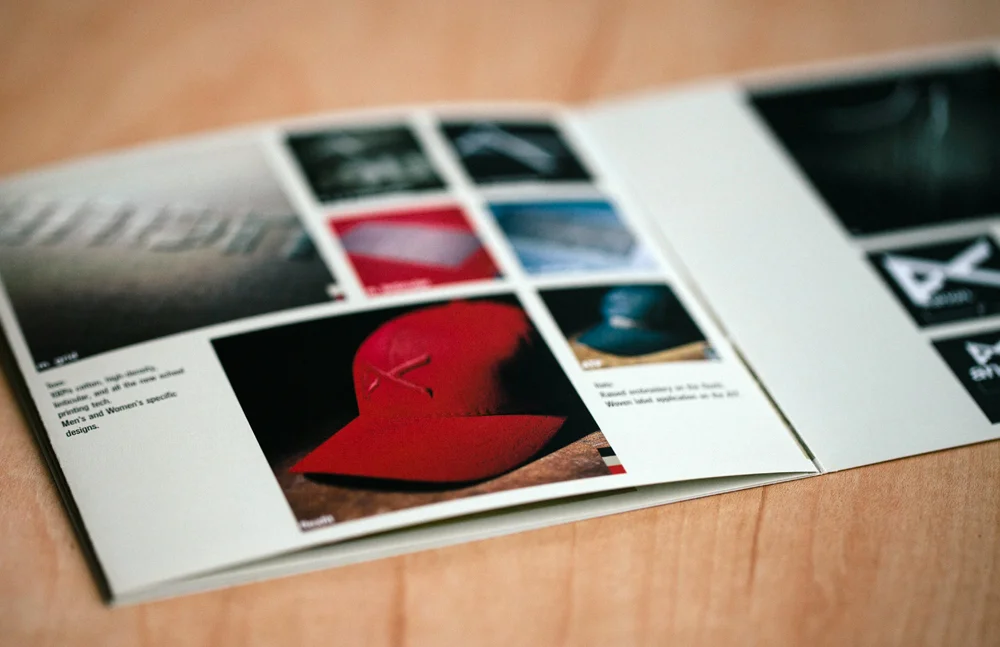
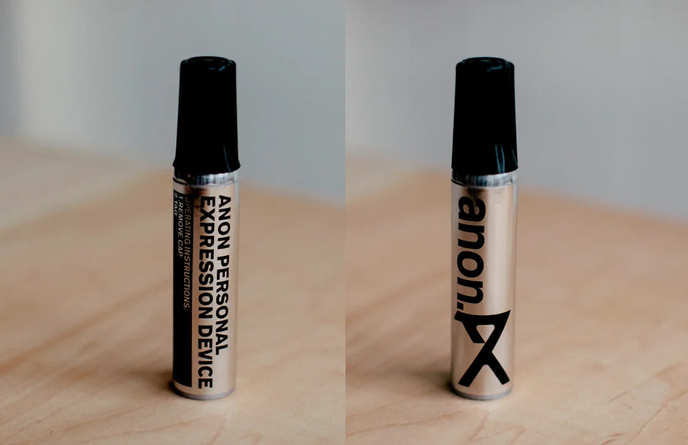
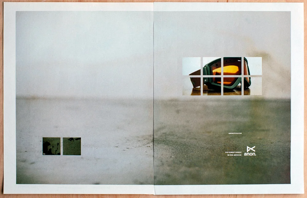
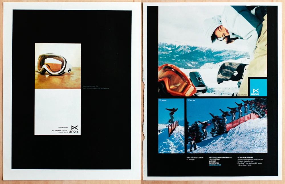
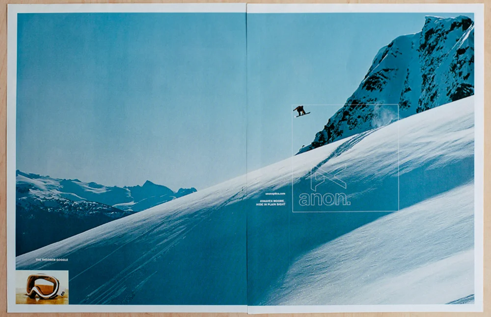
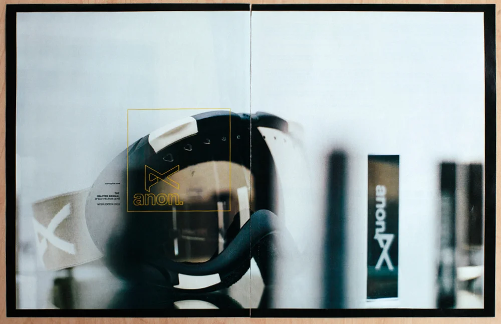
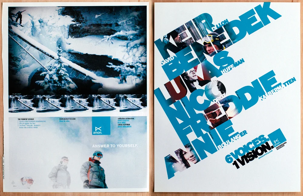
While at JDK I had the honor of launching a new optics brand from the Burton family. With the project came the opportunity to name it, name products (Figment, Theorem, Halcyon, Subrosa …), create the visual identity, design strap graphics, packaging, dealer catalogs, ads, consumer T-shirts and direct the design of trade show booths and, on occasion, offer advice on actual product form. In short, a dream design job.
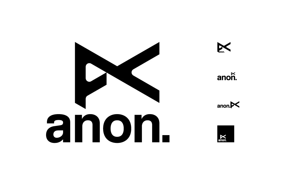
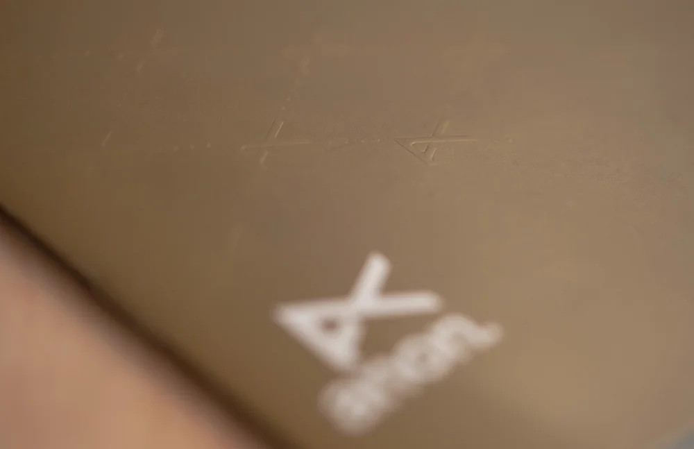
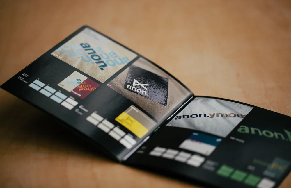
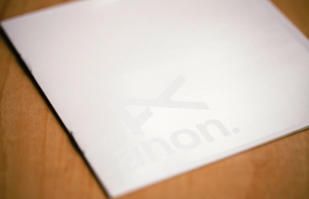
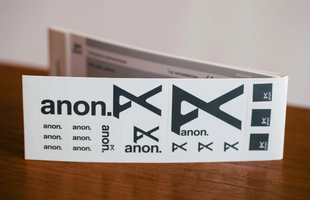
The name came from the fact the team riders liked the idea of bucking the rockstar, over-hyped flavor of the day and let their riding do the talking. Anon, short of “anonymous”, was chosen from over 50 names that were proposed. The logotype picked up on this theme by being as open-ended and anonymous as possible (it’s not Helvetica, but it has the same effect), by contrast the logo represents the rebellious spirit that lead to the name. Folded into the mark are references to the anarchy symbol, an anonymous “X” signature, how the human eye uses parallax to gain depth perception, and of course it’s an abstract “A”. It’s an identity built on the notion that the athletes representing it build the brand character through their riding, and their commitment to progression.
Anon is now in it’s 13th season, has since added sunglasses and is expanding into helmets for it’s 14th season. Of all the projects I worked on, anon holds a very special place in my heart.
(2000-2005. Work created at JDK.)